Testing new Mastodon clients
There have been a ton of new clients for Mastodon popping up left and right. But I may have found my new client of choice
One of my favorite things about Android 13 and its predecesor is the Material You theming engine. Some of my favorite apps such as Infinity for Reddit and Tachiyomi reader make use of it. For some reason Tusky is still not up to date in that regard, and so my search for a new client for Mastodon that used Material You began.
Most of the crazy going on over on Mastodon as of now is the talk about Ivory and IceCubes, which are a couple of Mastodon clients for Apple devices that are quite awesome and good. I wanted to see if there were some shiny new stuff for Android too.
There are apps like Megalodon and Moshidon, which are forks of the official Mastodon app, they are not bad at all though. But I wanted to find some other clients that were built from the ground up, just to see if there was anything new.
To my knowledge, there are only two clients that have support for Material You and are also not based on the official app. Kaiteki, which is quite a promising new client that even has support for Misskey; and Meowstodon, an even newer client that only supports Mastodon as of now.
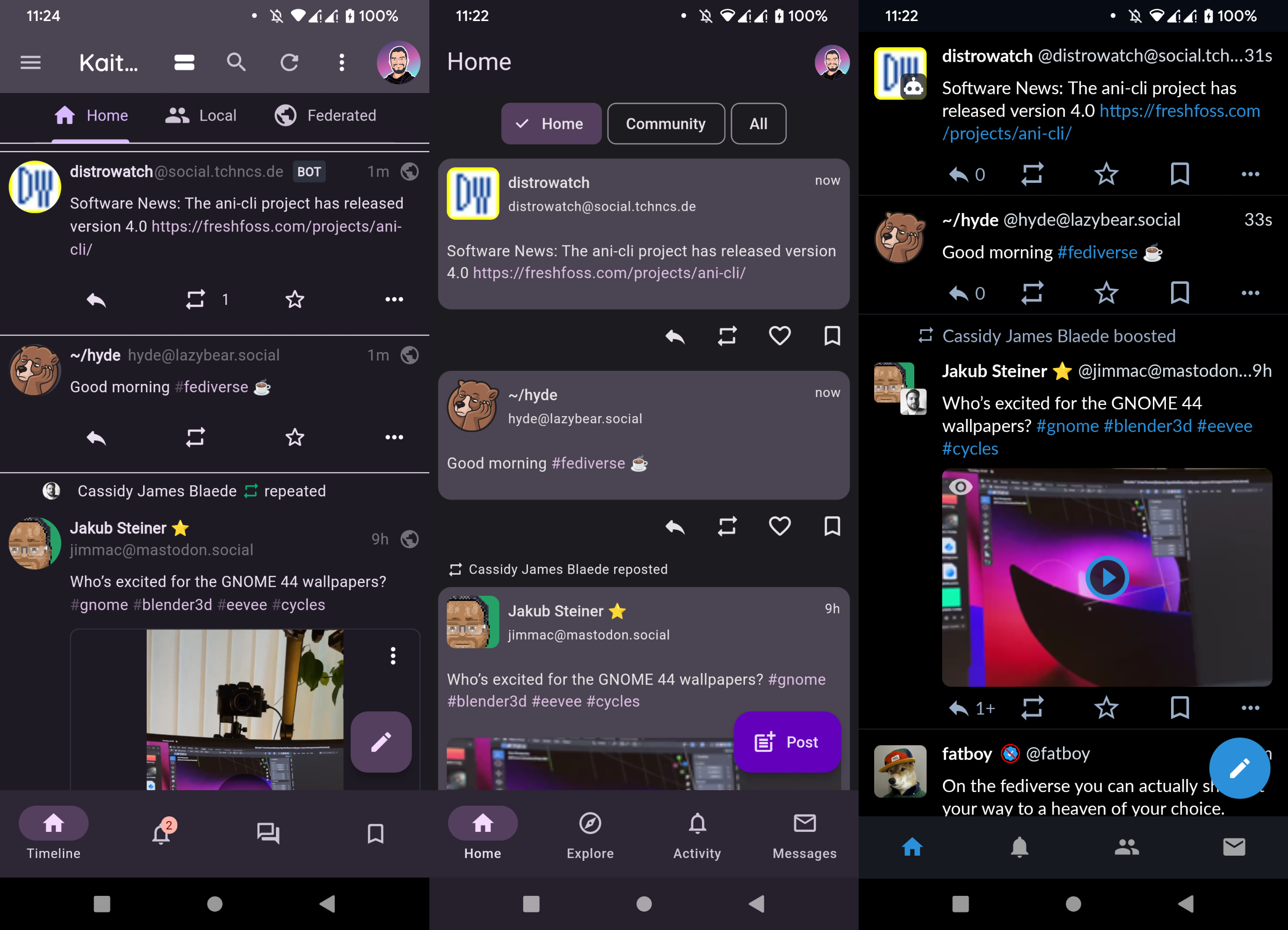
Honestly, both are still quite bare, but I’ve always loved being a beta and alpha tester for apps on Android. Right now Kaiteki feels a bit more mature but also too convoluted, it has a hamburger menu, and a ton of buttons at the top AND the bottom. This probably makes sense since its also works a desktop app, but I prefer my navigation to be reachable with my thumb, or with a gesture, which are usually broken due to Android’s navigation gesture being incompatible with sidebars after such a long time, hence my use of navigation buttons in 2023, they still rule!
Regardless, Meowstodon doesn’t have that problem, even if it still chooses to put my profile button at the top, I’ll give it a pass for now.

I have to say the spacing between posts is kind of crazy in both apps. I used to care a lot about the amount of text in my screen. Over time this was less of an issue, but still, as the image above shows, I can barely read 3 posts at a glance anywhere but on Tusky. I know Material You has some spacing guidelines and all, but a compact layout like the one Infinity for Reddit has would be quite ideal, especially being able to turn media into smaller thumbnails.
Kaiteki actually has quite a few layouts available, but its clear they are mostly intended for desktop usage, they are not ideal on mobile use as of now and their behavior is kinda wonky.
I can’t really judge much at this moment though, since there is quite a bit of active develpment going on and I expect these apps to change a lot in the following months. Meowstodon doesn’t even have a way to view profiles just yet. I can’t wait for whats coming up.
This is day 26 of #100DaysToOffload
Comments
If you have something to say, leave a comment, or contact me ✉️ instead
Reply via Fediverse
You can reply on any Fediverse (Mastodon, Pleroma, etc.) client by pasting this URL into the search field of your client:
https://fosstodon.org/@joel/109759591687726007


